Important Things to Keep in Mind for Creating Effective Word Documents:
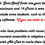
- Avoid Frilly Script. It is hard to read. sans serif fonts are your best bet. Click here to read about the difference between serif and sans serif fonts.
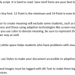
- Don’t use tiny font. 12 point is the minimum and 14 point is even better.
- Using color to create meaning will exclude some students, such as those with color blindness and those using adaptive technologies such as screen-reading software. If you use color to denote meaning, be sure to represent that meaning in some other way as well.
- Providing white space helps students who have trouble with visual processing.
- You must use Styles to make your document accessible to adaptive devices.
- Pictures and images must be tagged with Alt Text to make them legible to adaptive devices.
Click on Each Thumbnail Below to Compare and Contrast Word Documents.
When done viewing each thumbnail hit the back arrow on your web browser to return to this page.
Less Effective

More Effective

Read More about Creating Accessible Word Documents
Last Updated October 21, 2020
