
Important Things to Keep in Mind for Creating Effective PowerPoint Presentations:
- Keep your layout simple. This will make your presentation easier to read and it will therefore be a better teaching tool.
- Keep word choice simple but make sure content is detailed enough to convey your intended meaning.
- Make sure everything included in your presentation moves the content forward and is connected to the learning objectives for your assignment.
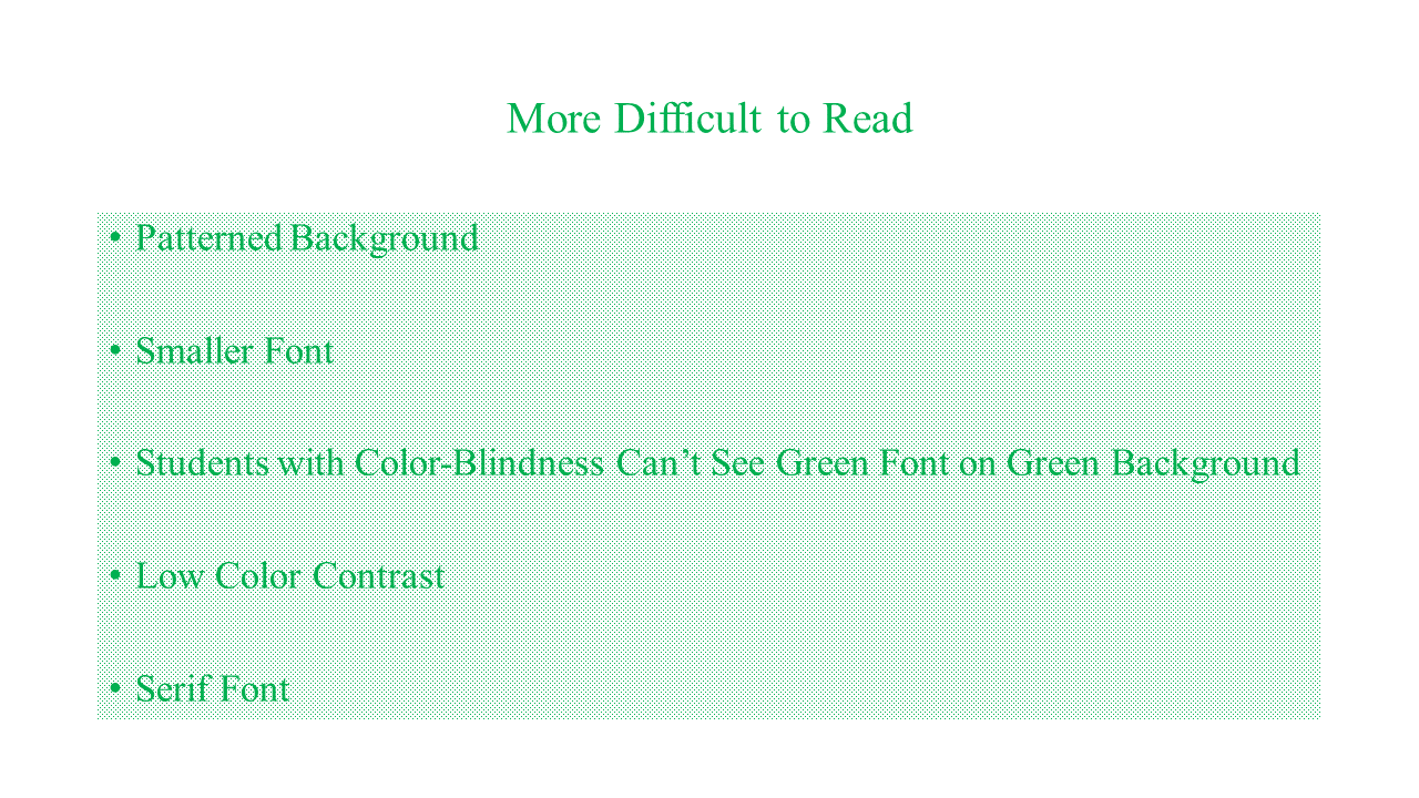
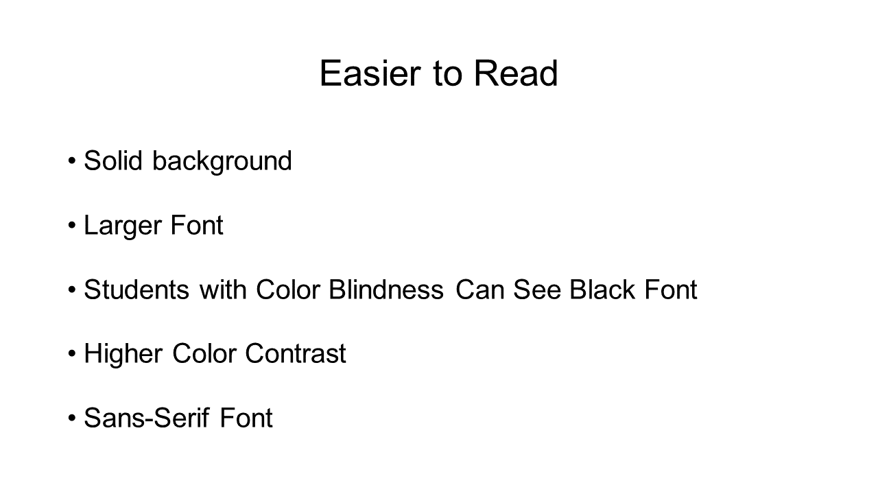
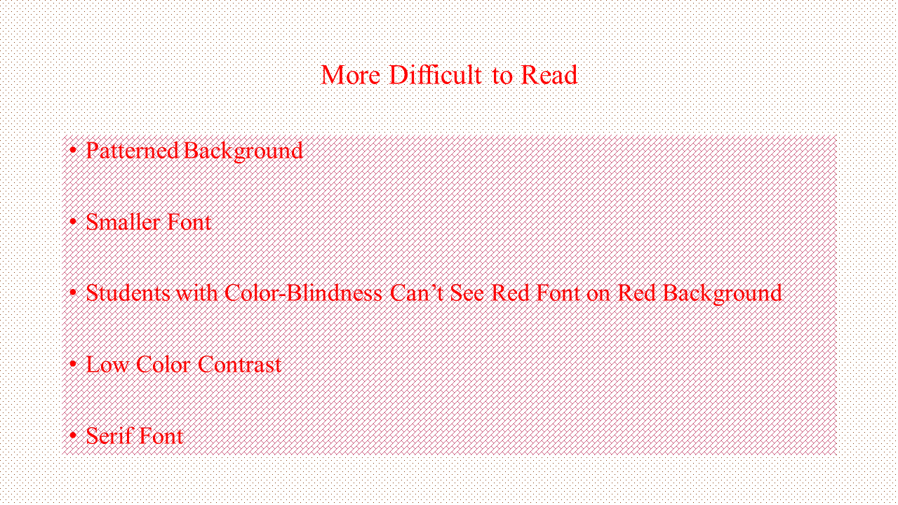
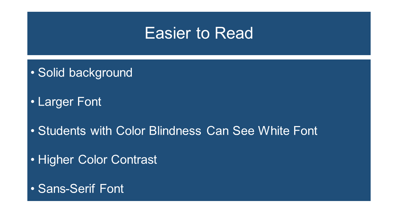
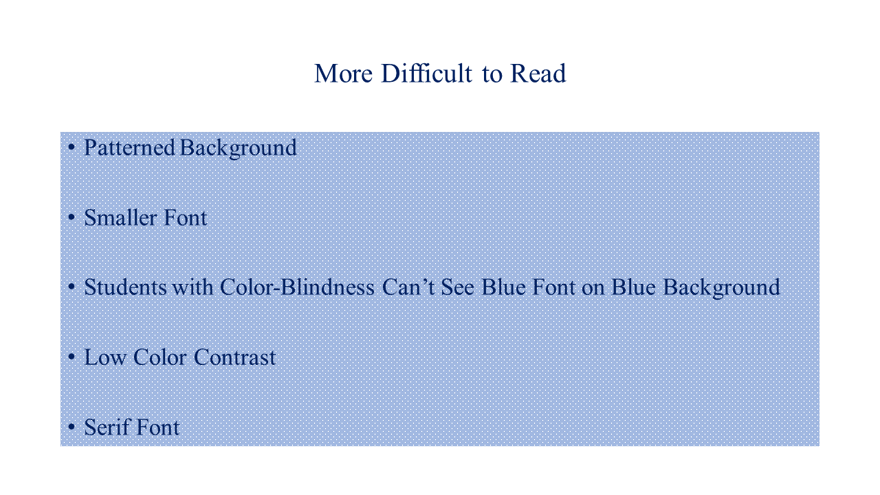
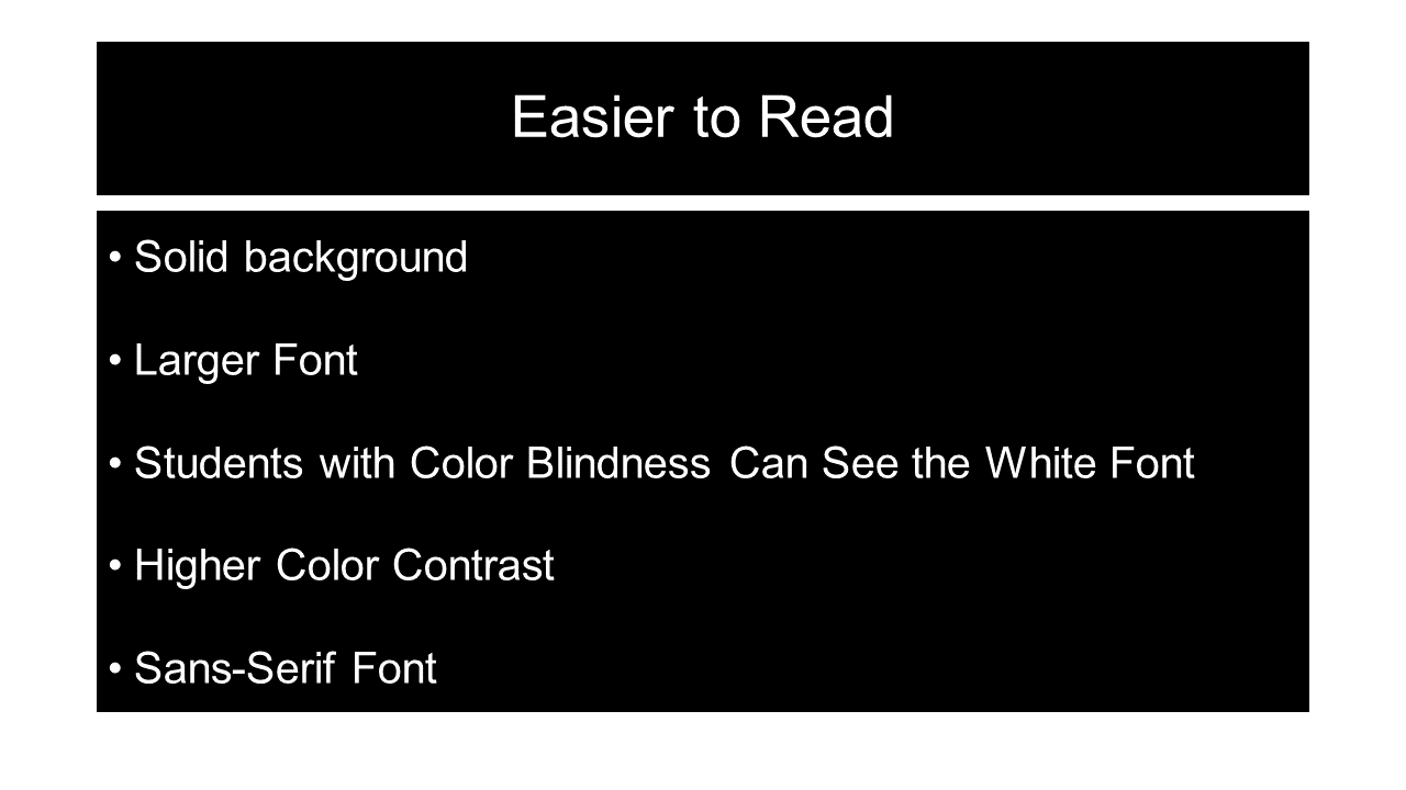
- Use a sans serif font and make sure text size is big enough to be easily legible. Serif fonts are more difficult to read, particularly for students who have any trouble with visual processing. Click here to read about the difference between serif and sans serif Fonts.
- Leave an adequate amount of uncluttered space. This will be particularly helpful to your students who have any trouble with visual processing.
- Use high contrast color-schemes. Light text on a dark background is much easier to read than dark text on a light background. Avoid using design features, such as patterned backgrounds, just because they look cool.
Click on Each Thumbnail Below to Compare and Contrast PowerPoint Slides.
When done viewing each thumbnail hit the back arrow on your web browser to return to this page.
Read about Creating Accessible PowerPoint Presentations
Last Updated October 21, 2020