Typography
Typography is another important element of a consistent visual identity.
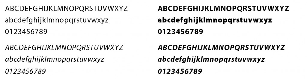
Myriad Pro
Myriad Pro is the primary font for Bellevue College and should be used for official college publications when possible.
Arial, Calibri, and Cambria may be substituted if you do not have access to Myriad Pro.
Myriad is a humanist sans-serif typeface designed with accessibility in mind, and was intended as a neutral, general-purpose typeface that could fulfill a wide range of uses. The Myriad typeface family has become a popular choice for both text and display composition.
Typography Tips
Please consider the following when formatting text:
- Use only one space after periods, colons, exclamation points, question marks, quotation marks—any punctuation that separates two sentences. Proportional spacing is automatically added, so only one space is necessary.
- Only use UPPERCASE for short headings or specific emphasis. Longer blocks of copy are more difficult to read when set in all capital letters.
- Use the condensed or extended version of a typeface within a font family. Do not manually condense or stretch a font.
- Script fonts should never be used in uppercase for an entire word or headline.
- Fully justified copy (text that is flush on both the left and right margins) should only be used in specific circumstances such as short line lengths on a multi-column page. Space is automatically inserted between words and letters which can make it difficult to read.
- Avoid underlined text. Instead, use italic or bold for emphasis.
- Use proper apostrophes (’) and quotation marks (“ ”)—not inch (“) or foot marks (‘).